
I don’t need to emphasize how important is to select the right color scheme for your designs. There are dozens of theories how to create a palette of colors that match, but there is no ultimate best method. You can create a great effect using chaotic color schemes, like the web site of Francois Chalet or you can follow the natural harmony like the works of sensed.
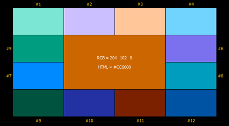
However, I’d like to recommend two sites, which will give you pretty good color schemes to work with. If you’ve got a specific color to start with, like a logo that need complementing and harmonizing colors, try using Easy RGB.
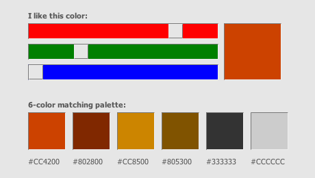
If you’d like to browse and find a color harmony of your liking you should try Colormatch. (Funny, as I was preparing the material for this article I selected a similar orange that I used for the CreativeBits logo and discovered that among the recommended colors similar greys can be found that I used for the CreativeBits web page.)
Commenting on this Blog entry is closed.