
The Saudi Arabian Airlines logo freaks me out. I realize that the swords are part of the national iconography, but I can’t help but think of plane hijacking. I mean what were they thinking? It’s an international brand! Surely they should’ve thought about the fact that any aggressive or disturbing imagery might hurt their brand.

Designers are breaking their heads about what angle they should portray the plane, so that it doesn’t look like as if it’s in uncontrolled descent, but taking off. They try to come up with international symbols with positive meanings. And these guys put a freaking double sword on their logo? Pirate airlines? At least the colors are good. They sort of calm you down, don’t they? 😉
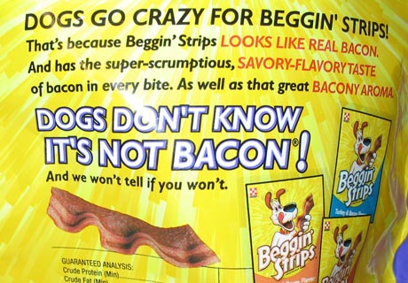
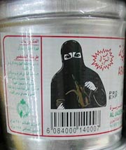 The coffee packaging with the lady in national dress is only for the local market and it portrays hospitality, but I have to admit that the image looks like a ninja preparing the instant potion for the dumb Eurotrash like me. 🙂 I realize these designs are culture specific and the fake bacon dog treat from Switzerland must seems as weird for the Arabs as the Arab designs for me. It’s not just that the dog and the bacon are both ‘haram’, but also the humorous tone of voice must feel alien to them. Or at least that’s my perception. If I have any Arab readers that are not exposed to western culture too much please confirm.
Do you have pictures of designs that you think might shock someone on the other side of the planet?
Commenting on this Blog entry is closed.