
Color management can be a very complex thing to understand and to implement. However, you don’t necessarily need to dig deep into the subject to take advantage of this sophisticated technology right away.
First of all, do you need color management? If you’re using a relatively small number of devices and they all work fine and you don’t experience problems reproducing colors than the answer is no. However, if sometimes your scans on the monitor or prints on the paper don’t match and you want total control over your colors in your system than read further.
Why do we need color management at all? That’s because all our devices, such as digital cameras, scanners, monitor, printer, etc. differ in color reproduction. Each has it’s own defect. Color management is there to compensate for these imperfections. Each device has it’s own so called ColorSync profile file (usually in format of devicename.icc), which describes the color capabilities of the device. So, for each device we own we need to find the respective ColorSync file. Usually hardware manufacturers provide these files as downloads on their sites. If they don’t have one, you can search the net for one. If all fails you can still create one.
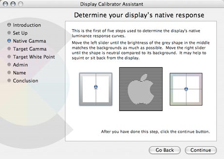
The first device that you need to calibrate is your monitor. In System Preferences/Display/Color you have a Calibrate button. Follow the instructions and crete a new Calibrated profile for your monitor. This file will be saved under your root/Library/ColorSync/Profiles/Displays/. Once you’re done, you should notice that the whites are ‘whiter’ and the grays are more neutral with no color cast, depending how off color your monitor was originally.
Most devices such as digital cameras and scanners embed their color profiles in the image files themselves, so you don’t need to worry about them, however you do need to find the .icc file for your printer if it’s not already installed with the printer drivers already. See under root/Library/Printers/…/Profiles/…
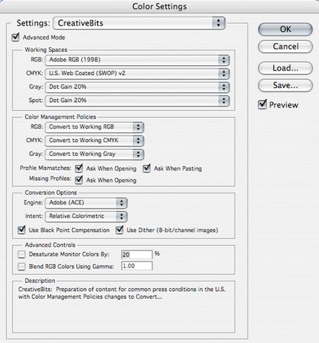
As a second step you need to configure your PhotoShop. Press Apple-Shift-K to open the Color Settings. (If you wish you can save your current settings before changing them, in case you want to revert.) On the top of the window the Settings: drop down menu will allow you to select the U.S. Prepress Defaults (or Europe Prepress Default, or Web Graphics Defaults respectively). Make sure that in Color Management Policies section all 3 options are set to Convert to Working… and all option switched on, so this way PS will prompt you whenever an image you’re opening or pasting in needs color management. You can download the settings file here.
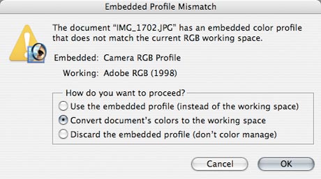
Now, when you open a file that has a different color profile to your set working space PS will notify you. You should agree to convert the image to the working profile. This way you will make sure you compensate for the imperfections of color reproduction of your input device. (For example my digital camera makes all reds too bright, but when once I convert it to Adobe RGB, all the colors are perfect.) Try opening the same image without any color management to see the difference.
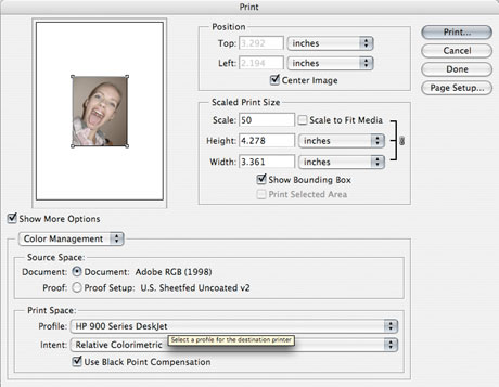
Now you can preview the effect (and limitations) of your output device by pressing Apple-Y and if you’re ready to send your artwork to the print house you can convert to CMYK. If you’re printing to an inkjet printer you should select Print with Preview (Apple-P) and in the Print Space area you should select your printers profile to achieve optimum results.
When you save your files from PS the working color profile will be embedded in the file, so when your printer opens the file he will be able to insert your work in his color management workflow.
This bit became a monster and still it’s not even nearly covering the subject. I’m planning to post about color management in more detail in order of importance later on.
Commenting on this Blog entry is closed.