
This is NOT to be a policitally charged post, and i urge Ivan to delete any comments that might be politically motivated, derogatory or anything else of the sorts. I’m posting this to show how research can prove important.
Here’s the new republican national convention logo:
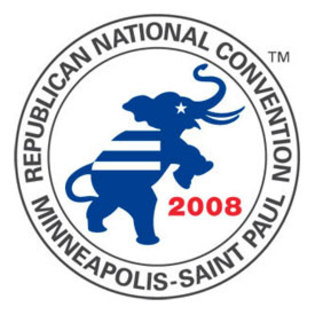
First error : color
Over the last few years the media has really pushed one concept, the republican party is represented in red, and the democratic party in blue.
Second error : the image
what do the racing stripe/prison bars mean?
Third and MAJOR error : the elephants position
Elephants, other then at a circus, only tend to stand on hind legs when having sexual intercourse. This the party of sexual scandals, which ironically some of them are going to prison, maybe that explains the stripes. The other irony, this is being held in Minneapolis, 7 miles from the airport that Larry Craig got busted in for trying to solicit gay sex from an undercover cop.
Fourth error : the star
Though I know it’s a symbol of american history/pride/identity, a star representing the eye in a drawing has OFTEN represented the idea that the person/animal is dead. Not a good idea to show your mascot as being dead….
Fifth error : the horns/tusks
Since when does the republican mascot of an elephant have tusks like a mammoth?
The lesson : do your research before you make a logo, and then do it again before you release that to the public.
Note: motivation for this thread is thanks to Keith Olbermann.